05-06-2019, 21:17
|
 |
Tech-Admin
|
|
Registriert seit: Dec 2000
Ort: Neuss
Beiträge: 37.842
OL Nick: xysvenxy
Style: cncboard
|
|
|
Sidebar und Update auf Reddit
Die Sidebar ist da 

Zitat:
We have concluded our Pre-production phase and are now formally into Production. The art team at Lemon Sky is in full swing creating 4k content, and Petroglyph is continuing to stand up more features every week. Multiplayer is now playable for Tiberian Dawn, and we even had a chance to show the software to the Community Council a few weeks ago. Overall this transition into Production is a big milestone for any project, and weve been humbled by all the support thus far.
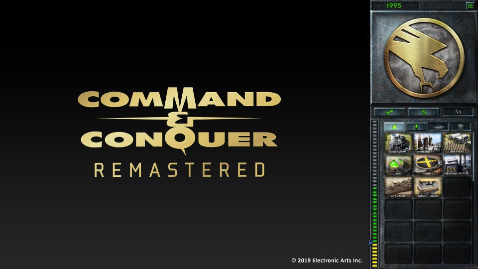
For this post, we wanted to share our approach to the in-game UI, and provide a sneak peek to our current in-progress version. Back when we announced the game in November, the UI was one of the key areas many of you in the community had passionate discussions about. As such, we listened to your videos, read comments from across the sites, and brainstormed with the Community Council. The trend we heard is that you still wanted the classic C&C Sidebar UI, but would welcome updates to the legacy UI to help the usability experience.
So with that in mind, one of the most requested improvements was to reduce the need for scrolling the Sidebar as much as possible. A key suggestion on how to accomplish this was to introduce the build tabs from Red Alert 2 and Tiberium Wars into the classic UI. We have thus decided to embrace this suggestion, and you can see the build tabs present in the associated preview image. However, because of the construction queue rules of the original games, we wanted to keep all buildings under a single tab, with associated tabs for Infantry, Vehicles (Air, Land, Naval), and Support Powers. To further support the goal of reduced scrolling, we have then designed the Sidebar to fit 18 build buttons. The combination of these elements means youll need to scroll much less, and along the way will benefit from many of the modern feedback elements of more recent C&C titles.
In terms of cosmetic design, we wanted the UI to follow our overall project direction of keeping elements authentic to the legacy version. Weve done our best to capture the visual spirit of Tiberian Dawn, and or course would embrace a similar approach for Red Alert. We are recreating the build buttons in the spirit of the Gold Edition style, and again aiming to keep these as authentic as possible to the original design while preparing them for a 4k experience. Other updates include replacing the Repair, Sell, and Map buttons for icons to support our eventual localization efforts. And weve also shifted the Money and Options sections to above the radar map to ensure optimal screen allocation for the battlefield. All of these changes are done in the aspiration of keeping the spirit of the legacy Sidebar, while optimizing for a modern RTS gameplay experience.
Given the ongoing amount of passion around this UI topic, we are certainly eager to hear your thoughts in the comments, and looking forward to making the best UI experience possible for C&C Remastered.
Cheers,
Jim Vessella
Jimtern
|
https://www.reddit.com/r/commandandc...debar_preview/
__________________
Zitat:
|
Wir sind im Augenblick dabei, zu prüfen, ob es im öffentlichen Interesse liegt, ihnen mitzuteilen, ob wir die Informationen haben, die Sie erbitten, und ob es, sollte das der Fall sein, im öffentlichen Interesse liegt, Ihnen diese Informationen zur Verfügung zu stellen.
|
|


 es kann nur einen geben

